To mark the end of the Game of Thrones series, Les Vignobles Bardel chose to extend their customers’ experience through wine labels inspired by the world of the show. These labels combine creativity and precision, highlighting every visual detail to tell a story on the bottle.
Labels that extend the visual universe of the series
The final episode marked a cultural turning point and sparked a strong desire among fans to keep the story alive. Each visual is inspired by the worlds imagined by George R. R. Martin and graphically translates the series’ most iconic elements. The print quality ensures faithful reproduction of the colours and textures desired by the winemaker.
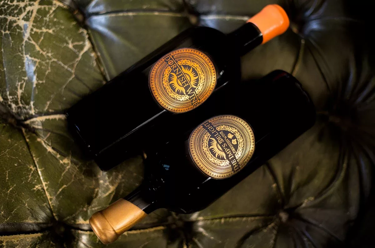
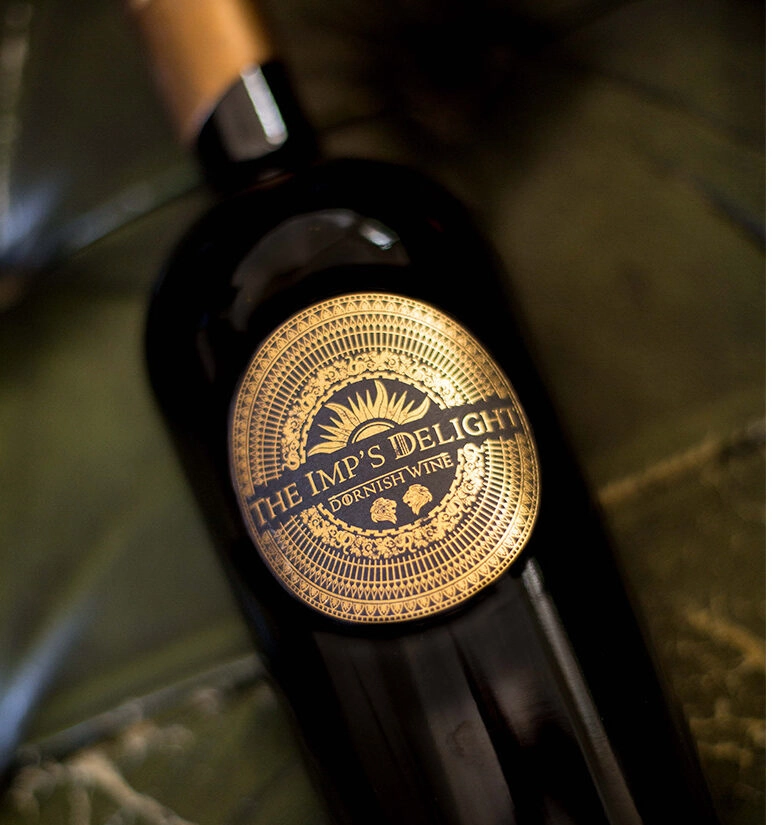
“The Imp’s Delight”: a tribute to Tyrion Lannister
The “The Imp’s Delight” label is inspired by one of the series’ best-known characters. The choice of textures, colours, and graphic details brings out this character’s sharp mind and universe, while staying true to the wine’s identity. The printing technology ensures that every nuance is reproduced with precision.
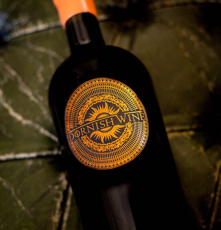
“Dornish Wine”: an immersion into the land of Dorne
For “Dornish Wine”, the goal was to reflect the strong identity of the Dorne region. Warm tones and graphic motifs evoke the world of House Martell while remaining consistent with the product. The printing techniques used preserve this aesthetic and highlight the intricate details created by the winemaker.
Autajon expertise at the heart of storytelling
These creations show how a label can become a storytelling medium. They tell a story and visually convey the universe of the series while showcasing the wine. Technical precision and attention to detail make it possible to create immersive labels that extend the consumer experience and highlight the care given to every bottle.